Quasar Typography     

See how headings, blockquotes, definitions lists and more are displayed in the demo. At the end of this page you can read about CSS helper classes.

Headings

<h1>Light 112sp</h1>
<!-- or: --><div class="q-display-4">Light 112sp</div>

<h2>Regular 56sp</h2>
<!-- or: --><div class="q-display-3">Regular 56sp</div>

<h3>Regular 45sp</h3>
<!-- or: --><div class="q-display-2">Regular 45sp</div>

<h4>Regular 34sp</h4>
<!-- or: --><div class="q-display-1">Regular 34sp</div>

<h5>Regular 24sp</h5>
<!-- or: --><div class="q-headline">Regular 24sp</div>

<h6>Medium 20sp</h6>
<!-- or: --><div class="q-title">Medium 20sp</div>

<div class="q-subheading">Regular 16sp</div>

<div class="q-body-2">Medium 14sp</div>

<div class="q-body-1">Regular 14sp</div>

<div class="q-caption">Regular 12sp</div>

Weights

Class Name
text-weight-thin
text-weight-light
text-weight-regular
text-weight-medium
text-weight-bold
text-weight-bolder

Text Types

You can display text in a variety of ways.

<!-- Small and Big text -->
<small>Text</small>
<big>Text</big>

<!-- sub and sup -->
<sub>Subtext</sub>
<sup>Supertext</sup>

<!-- Bold or italic -->
<p class="text-bold">Bold text</p>
<!-- or: --><strong>Bold text</strong>
<p class="text-italic">Italic text</p>
<!-- or: --><em>Italic text</em>

<!-- Quotes -->
<div class="quote">
Lorem ipsum dolor sit amet, consectetur adipiscing elit. Integer posuere erat a ante.
</div>

<div class="quote text-right">
Lorem ipsum dolor sit amet, consectetur adipiscing elit. Integer posuere erat a ante.
</div>

<!-- Blockquotes -->
<blockquote>
<p>Lorem ipsum dolor sit amet, consectetur adipiscing elit. Integer posuere erat a ante.</p>
<small>Someone famous for <cite title="Quasar Framework">Quasar Framework</cite></small>
</blockquote>

<blockquote class="text-right">
<p>Lorem ipsum dolor sit amet, consectetur adipiscing elit. Integer posuere erat a ante.</p>
<small>Someone famous for <cite title="Quasar Framework">Quasar Framework</cite></small>
</blockquote>

<!-- Definition Lists -->
<dl>
<dt>Description lists</dt>
<dd>A description list is perfect for defining terms.</dd>
<dt>Euismod</dt>
<dd>Vestibulum id ligula porta felis euismod semper eget lacinia odio sem nec elit.</dd>
</dl>

<dl class="horizontal">
<dt>Description lists</dt>
<dd>A description list is perfect for defining terms.</dd>
<dt>Euismod</dt>
<dd>Vestibulum id ligula porta felis euismod semper eget lacinia odio sem nec elit.</dd>
</dl>

CSS Helper Classes

Class Name Description
text-right Align text to the right
text-left Align text to the left
text-center Align text to the center
text-justify Text will be justified
text-truncate Applies all CSS tweaks to truncate text when container is too small
text-bold Text will be in bold
text-italic Text will be in italic
text-no-wrap Non wrapable text (applies white-space: nowrap)
uppercase Transform text to uppercase
lowercase Transform text to lowercase
capitalize Capitalize first letter of the text
round-borders Every Quasar Theme has a generic border radius. This radius is applied to the DOM node
block display property set to block
no-margin Margins are set to 0
no-padding Padding is set to 0
no-outline Outline is set to 0

Default MD Font

The default font embedded in Quasar App when built with Material Design Theme is Roboto. But it is not required. You can use whatever font(s) you like.

Roboto comes with 5 different font weights you can use: 100, 300, 400, 500, 700. Below is an image from Google’s Roboto Specimen document displaying the different font weights:
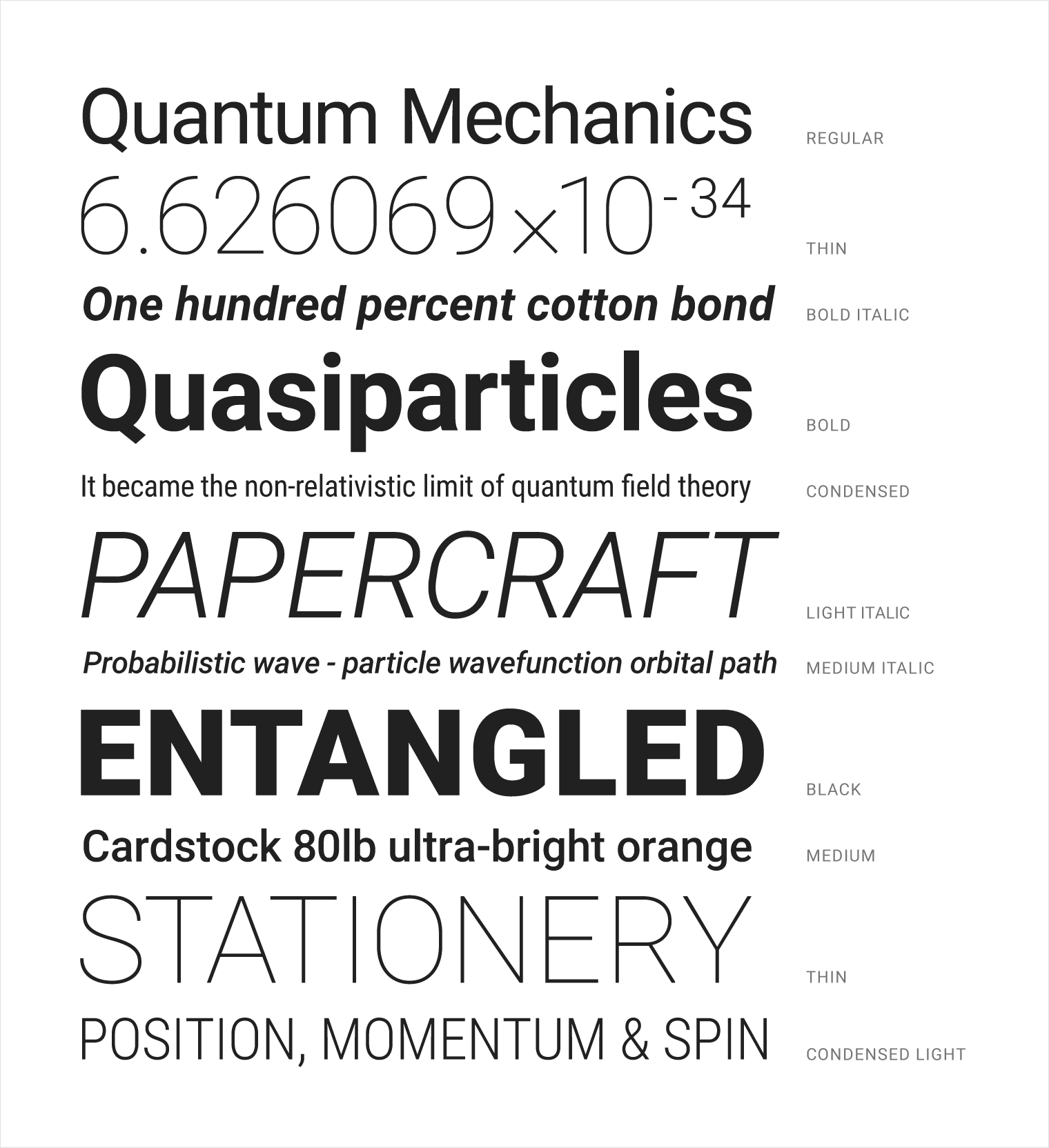

Roboto Font

This is where Roboto font comes embedded by default, if you are looking to remove it:

// file: /quasar.conf.js
extras: [
ctx.theme.mat ? 'roboto-font' : null
]

Notice that the font is only included when developing/building with Material Theme.